
Data scientists usually need to check the statistics of their datasets, particularly against known distributions or comparing them with other datasets. There are several hypothesis tests we can run for this goal, but I often prefer using a simple, graphical representation. I’m talking about Q-Q plot.
What is Q-Q plot?
Q-Q plot is often called quantile plot. It is a 2D plot in which we compare the theoretical quantiles of a distribution with the sample quantiles of a dataset. If the dataset has been generated from that distribution, we expect this chart to be close to a 45-degree line, because the sample quantiles will be similar to the theoretical quantiles. If the sample has been generated from a different distribution, we won’t get a 45 line.
In this way, we can easily visualize if a dataset is similar to a theoretical distribution. We can use Q-Q plots even for comparing two datasets, as long as they have the same number of points.
Q-Q plots are a very useful kind of data visualization for exploratory analysis purposes. I have created an entire online course about Exploratory Data Analysis with Python, so if you want to know more about this topic, I’m sure you’ll find this course very useful.
An example in Python
Let’s now see how Q-Q plot works in Python. You can find the whole code on my GitHub repo.
First, let’s import some libraries and let’s set the random number seed in order to make our simulations reproducible.
from statsmodels.graphics.gofplots import qqplot
from matplotlib import pyplot as plt
plt.rcParams['figure.figsize'] = [10, 7]
plt.rc('font', size=14)
from scipy.stats import norm, uniform
import numpy as np
np.random.seed(0)
Let’s now simulate 1000 uniformly distributed points between 0 and 1 and let’s compare this dataset to a normal distribution with the same mean and variance. We expect to get a Q-Q plot that is very different from a 45-degree line, because the two distributions are quite different.
x = np.random.uniform(1,2,1000)In order to plot the Q-Q plot with this dataset against the best fit normal distribution, we can write this code:
qqplot(x,norm,fit=True,line="45")
plt.show()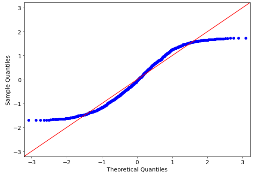
The fit=True argument tries to fit a normal distribution to our dataset according to maximum likelihood. As we can see, the sample quantiles are quite different from the theoretical quantiles, because the blue points are very far from the red line, which is a 45 degree line.
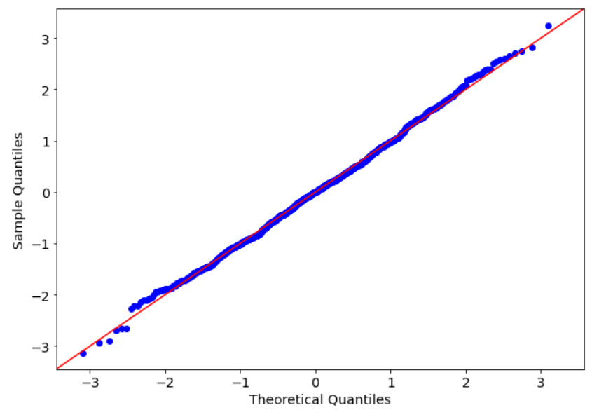
Let’s now try with a normally distributed dataset.
x = np.random.normal(1,2,1000)
qqplot(x,norm,fit=True,line="45")
plt.show()
The result is quite different, now. The sample quantiles are very similar to the theoretical quantiles (i.e. the blue points are close to the red line). There are some outliers that make some noise at the lower and upper bounds of this chart, but it’s not a huge problem, because the greatest part of the sample distribution fits quite well with the theoretical one.
Of course, changing the second argument of the qqplot function we can compare our sample dataset with another distribution. For example, we can compare our normally distributed dataset with a uniform distribution.
qqplot(x,uniform,fit=True,line="45")
plt.show()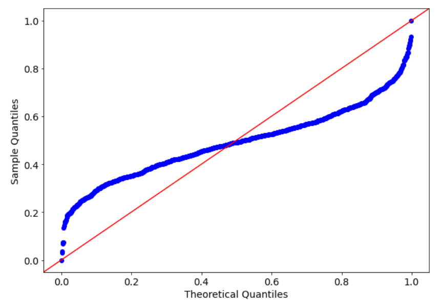
As expected, the result is not so good, because the distribution our dataset has been generated from is very different from the best fitting uniform distribution.

Q-Q plot with 2 datasets
Q-Q plot can be used even with 2 datasets, as long as they have the same number of points. To get the sample quantiles of both datasets, we only have to sort them ascending and plot them.
Let’s generate two normally distributed datasets from 2 normal distribution with the same mean and the same variance.
x1 = np.random.normal(1,2,1000)
x2 = np.random.normal(1,2,1000)
Now we can sort our data:
x1.sort()
x2.sort()
And then we can plot it:
plt.scatter(x1,x2)
plt.plot([min(x1),max(x1)],[min(x1),max(x1)],color="red")
plt.xlabel("1st dataset's quantiles")
plt.ylabel("2nd dataset's quantiles")
plt.show()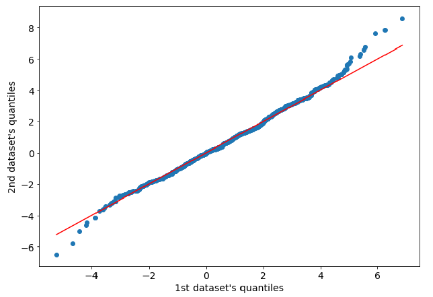
As we can see, there’s still a bit of noise at the tails, but the central part of the distributions matches quite well.
Conclusions
In this article, I show how to use Q-Q plot to check the similarity between a sample distribution and a theoretical distribution or between two samples. Although there are some hypothesis tests that can be performed to accomplish this goal (e.g. Kolmogorov-Smirnov test), I prefer using data visualization in order to have a visual representation of the phenomena inside our dataset. In this way, our interpretation is not biased by any hypothesis test and is more clear to present even to non-technical people.


In the given example, the Q-Q plot is used to compare a dataset with a theoretical distribution. However, what are the limitations or considerations to keep in mind when using Q-Q plots for checking the distribution of data? Are there any specific assumptions or requirements for the data or the distribution being compared?