
This post contains product affiliate links. We may receive a commission from Amazon if you make a purchase after clicking on one of these links. You will not incur any additional costs by clicking these links.
Neural networks are fascinating and very efficient tools for data scientists, but they have a very huge flaw: they are unexplainable black boxes. In fact, they don’t give us any information about feature importance. Fortunately, there is a powerful approach we can use to interpret every model, even neural networks. It is the SHAP approach.
Let’s see how to use it for explain and interpret a neural network in Python.
If you want to know more about neural networks first, I suggest reading this book.
What is SHAP?
SHAP stands for SHapley Additive exPlanations. It’s a way to calculate the impact of a feature to the value of the target variable. The idea is you have to consider each feature as a player and the dataset as a team. Each player gives their contribution to the result of the team. The sum of these contributions gives us the value of the target variable given some values of the features (i.e. given a particular record).
The main concept is that the impact of a feature doesn’t rely only on the single feature, but on the entire set of features in the dataset. So, SHAP calculates the impact of every feature to the target variable (called shap value) using combinatorial calculus and retraining the model over all the combination of features that contains the one we are considering. The average absolute value of the impact of a feature against a target variable can be used as a measure of its importance.
A very clear explanation of SHAP is given in this great article. If you need deeper focus on this technique, you can read this book as well.
The benefit of SHAP is that it doesn’t care about the model we use. In fact, it is a model-agnostic approach. So, it’s perfect to explain those models that don’t give us their own interpretation of feature importance, like neural networks.
Let’s see how to use SHAP in Python with neural networks.
An example in Python with neural networks
In this example, we are going to calculate feature impact using SHAP for a neural network using Python and scikit-learn. In real-life cases, you’d probably use Keras to build a neural network, but the concept is exactly the same.
For this example, we are going to use the diabetes dataset of scikit-learn, which is a regression dataset.
Let’s first install shap library.
!pip install shapThen, let’s import it and other useful libraries.
import shap
from sklearn.preprocessing import StandardScaler
from sklearn.neural_network import MLPRegressor
from sklearn.pipeline import make_pipeline

from sklearn.datasets import load_diabetes
from sklearn.model_selection import train_test_split
Now we can load our dataset and the feature names, that will be useful later.
X,y = load_diabetes(return_X_y=True)
features = load_diabetes()['feature_names']
We can now split our dataset into training and test.
X_train, X_test, y_train, y_test = train_test_split(X, y, test_size=0.33, random_state=42)Now we have to create our model. Since we are talking about a neural network, we must scale the features in advance. For this example, I’ll use a standard scaler. The model itself is a feedforward neural network with 5 neurons in the hidden layer, 10000 epochs and a logistic activation function with an auto-adaptive learning rate. In real life, you will optimize these hyperparameters properly before setting these values.
model = make_pipeline(
    StandardScaler(),
    MLPRegressor(hidden_layer_sizes=(5,),activation='logistic', max_iter=10000,learning_rate='invscaling',random_state=0)
)
We can now fit our model.
model.fit(X_train,y_train)Now it comes the SHAP part. First of all, we need to create an object called explainer. It’s the object that takes, in input, the predict method of our model and the training dataset. In order to make SHAP model-agnostic, it performs a perturbation around the points of the training dataset and calculates the impact of this perturbation to the model. It’s a type of resampling technique, whose number of samples are set later. This approach is related to another famous approach called LIME, which has been proved to be a special case of the original SHAP approach. The result is a statistical estimate of the SHAP values.

So, first of all let’s define the explainer object.
explainer = shap.KernelExplainer(model.predict,X_train)Now we can calculate the shap values. Remember that they are calculated resampling the training dataset and calculating the impact over these perturbations, so ve have to define a proper number of samples. For this example, I’ll use 100 samples.
Then, the impact is calculated on the test dataset.
shap_values = explainer.shap_values(X_test,nsamples=100)A nice progress bar appears and shows the progress of the calculation, which can be quite slow.
At the end, we get a (n_samples,n_features) numpy array. Each element is the shap value of that feature of that record. Remember that shap values are calculated for each feature and for each record.
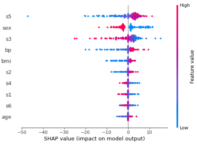
Now we can plot what is called a “summary plot”. Let’s first plot it and then we’ll comment the results.
shap.summary_plot(shap_values,X_test,feature_names=features)Each point of every row is a record of the test dataset. The features are sorted from the most important one to the less important. We can see that s5 is the most important feature. The higher the value of this feature, the more positive the impact on the target. The lower this value, the more negative the contribution.
Let’s go deeper inside a particular record, for example the first one. A very useful plot we can draw is called force plot
shap.initjs()
shap.force_plot(explainer.expected_value, shap_values[0,:]  ,X_test[0,:],feature_names=features)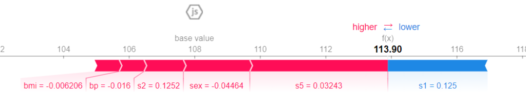
113.90 is the predicted value. The base value is the average value of the target variable across all the records. Each stripe shows the impact of its feature in pushing the value of the target variable farther or closer to the base value. Red stripes show that their features push the value towards higher values. Blue stripes show that their features push the value towards lower values. The wider a stripe, the higher (in absolute value) the contribution. The sum of these contributions pushes the value of the target variable from the vase value to the final, predicted value.
As we can see, for this particular record, bmi, bp, s2, sex and s5 values have a positive contribution to the predicted value. s5 is still the most important variable of this record, because its contribution is the widest one (it has the largest stripe). The only variable that shows a negative contribution is s1, but it’s not strong enough to move the predicted value lower than the base value. So, since the total positive contribution (red stripes) is larger than the negative contribution (blue stripe), the final value is greater than the base value. That’s how SHAP works.
As we can see, we are learning several things about feature importance by reading only these charts. We don’t care about the model we are using, because SHAP is a model-agnostic approach. We just care about how the features impact the predicted value. This is very helpful for explaining black-boxes models like, in this example, neural networks.
We could never achieve such a knowledge of our dataset just knowing the weights of our neural network and that’s why SHAP is a very useful approach.
You can find a complete use of this technique and several other ways to explain machine learning models in this book.
Conclusions
SHAP is a very powerful approach when it comes to explaining models that are not able to give use their own interpretation of feature importance. Such models are, for example, neural networks and KNN. Although this method is quite powerful, there’s no free lunch and we have to suffer some computationally expensive calculations that we must be aware of.


Hello. fantastic job. I did not imagine this. This is a remarkable story. Thanks!
Thank you! I’m glad you like it!
I’m truly enjoying the design and layout of your blog. It’s a very easy on the eyes which makes it much more pleasant for me to come here and visit more often. Did you hire out a developer to create your theme? Fantastic work!
Thanks! No, I used a WordPress template that I customized a bit by myself.
Hi, Very helpful! Thank you.
Is there any threshold for the values in continuous variables to be red or blue in SHAP summary plot?
Hi! No, there’s no threshold. They follow a color gradient.
Hi, thanks for your contribution. I’ve been facing issues trying to use a Pipeline and Shap. Which Shap version your worked with for this example?