Dealing with imbalanced datasets is always hard for a data scientist. Such datasets can create trouble for our machine learning models if we don’t deal with them properly. So, measuring how much our dataset is imbalanced is important before taking the proper precautions. In this article, I suggest some possible techniques.
How do we define “imbalanced”?
We say that a classification dataset is imbalanced when there are some target classes with very low frequencies than others.
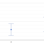
Let’s see, for example, the distribution of the target variable of the iris dataset.
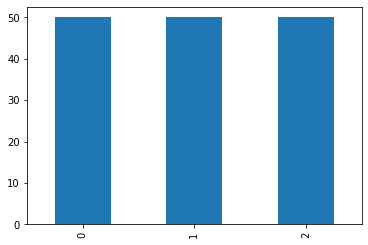
As we can see, the frequencies are all the same and the dataset is perfectly balanced.
Let’s now change our dataset and use the breast cancer dataset.
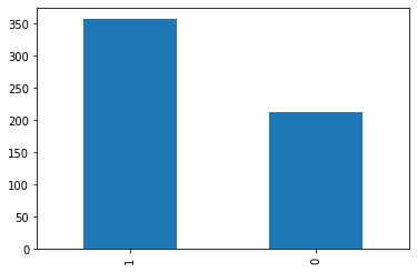
As we can see, the 2 classes have different frequencies, so the dataset is imbalanced.
So, generally speaking, different frequencies allow us to say that the dataset is imbalanced. However, common experience leads to defining as “imbalanced” a dataset in which the target values have very different frequencies.
In fact, slightly different frequencies aren’t, generally speaking, a great problem for most of the models. The problems arise when one or more classes have a very small frequency. In these situations, a model may not be able to learn properly how to deal with them.
As usual, we have to quantify what “very small” means. Let’s see some techniques to assess whether we should consider a dataset imbalanced or not.
Data visualization
Data visualization can give us some very useful insights, so why shouldn’t we use it for this task?
The approach I suggest is to plot a bar chart with the frequencies of the classes and their 95% confidence intervals. Remember that, given a frequency p and a total number of events equal to N, a 95% confidence interval is calculated as follows:
\left( p-1.96\sqrt{\frac{p(1-p)}{N}}, p+1.96\sqrt{\frac{p(1-p)}{N}} \right)Given m classes, the expected frequency is 1/m. So, we can plot the confidence intervals and a horizontal line related to the expected frequency and see if it crosses the confidence intervals.
Let’s first import some libraries and the “breast cancer” dataset.
import numpy as np
import pandas as pd
from scipy.stats import norm,chisquare
import matplotlib.pyplot as plt
from sklearn.datasets import load_breast_cancer as d

X,y = d(return_X_y = True)
Let’s now plot the bar chart with the frequencies of the classes, the 95% confidence intervals and the expected frequency.
freqs =pd.Series(y).value_counts() /len(y)
std_errors = np.sqrt(freqs*(1-freqs)/len(y))
expected_frequency = 1/len(np.unique(y))

freqs.plot(kind='bar',yerr=std_errors*1.96)

plt.axhline(expected_frequency,color='red',linestyle='--')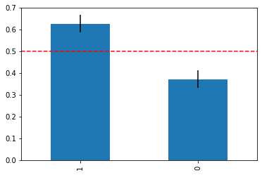
As we can see, the intervals are far from the expected frequency, so there’s only a 5% confidence that the dataset is balanced. Pretty small.
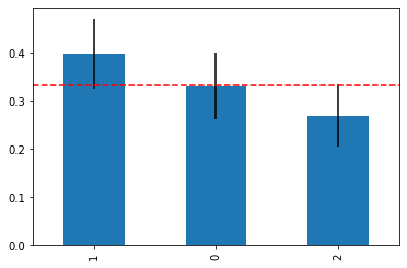
If we repeat the process with the “wine” dataset, here’s the result.
Now, the expected frequency line crosses the confidence intervals correctly for class 0, but only marginally for classes 1 and 2. So we can say that, with a 95% confidence, class 0 is balanced and we aren’t sure about classes 1 and 2.
This simple approach can give us clear and graphical evidence, which is always a good idea in data science.
z test
For those who like the use of p-values, we can calculate the p-value of a t-tailed z test in order to assess the statistical difference between the given frequencies and the expected frequency. We have to perform a z test for each class. The null hypothesis is that the frequencies are equal to the expected frequency (i.e. the dataset is balanced).
The z variable that compares a given frequency with an expected frequency 1/m over a number of events equal to N is:
z = \frac{p-1/m}{\sqrt{\frac{p(1-p)}{N}}}For a two-tailed z test, the p-value is:
\textrm{p-value}=2\cdot\textrm{Prob}(\textrm{normal variable} < -|z|)We multiply by 2 because it’s a two-tailed test.
In Python, we can write:
for target_val in freqs.index:
  z = (freqs[target_val] - expected_frequency)/std_errors[target_val]

  print("Class:",target_val)
  print("p-value:",norm.cdf(-np.abs(z)))
  print("----")
For the breast cancer dataset, the result is:
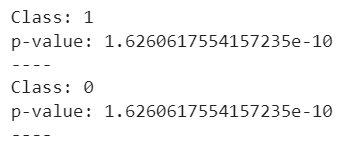
The p-values are very small, so we reject the null hypothesis that states that the dataset is balanced.
For the wine dataset, we get:
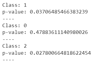
These results perfectly fit with the graphical analysis. p-values for classes 1 and 2 are small and we reject the null hypothesis. The p-value for class 0 is high and we don’t reject the null hypothesis.
Chi-squared test
If we want to use a single test for the whole dataset rather than using a test for each class, we can use Pearson’s chi-squared test.
If we have m classes and N total records and each class as ni records, we can calculate the p-value of such a test by calculating the statistics:
\chi^2 = \sum_{i=1}^m \frac{(n_i-N/m)^2}{N/m}This variable is distributed as a chi-squared distribution with m-1 degrees of freedom. The test we can perform is a one-tailed test. The null hypothesis is that the dataset is balanced.
In Python, we can do it with just one line of code:
chisquare(pd.Series(y).value_counts()).pvalueFor the breast cancer dataset, the result is 1.211e-09. So we reject the null hypothesis. For the wine dataset, the p-value is 0.107, so we don’t reject the null hypothesis.
Remember that the chi-squared test works only if your expected number of occurrences is large (i.e. greater than 20), otherwise the approximations behind it won’t be reliable anymore.
Some practical suggestions
My suggestion is to always use data visualization. It’s clear and unbiased, so it’s always a good idea. However, if your colleagues need a p-value, you can use the z test to assess the p-value class by class. Otherwise, you can calculate an overall result using a chi-squared test.
Conclusions
In this article, I suggest some techniques to assess whether a dataset is imbalanced or not. Choosing the proper technique will give you different insights and will lead you to different strategies to deal with your imbalanced data (like, for example, SMOTE resampling or class grouping).