Histograms are a very useful tool when we want to give a quick sight to the shape of our data. However, we always have to choose the right number of bins.
What is a histogram?
A histogram is a representation of the probability distribution of a dataset. Given a bin width, the range of the variable is splitted into non-overlapping intervals of that width and, for each interval, we count how many values fall inside it. This determines the height of the histogram bar.
Histograms are very useful because they are able to give us a clear overview of the shape of the distribution of a variable. We can easily see if a variable is skewed, if it’s multimodal, if it has fat tails and so on. That’s why mastering the use of histograms is mandatory for any data scientist and analyst.
But there’s a problem: how to choose the number of bins in a histogram?
The number of bins
Let’s make a simple example in Python. Let’s simulate 6000 randomly generated points from a normal distribution.
import numpy as np
import matplotlib.pyplot as plt
np.random.seed(0)
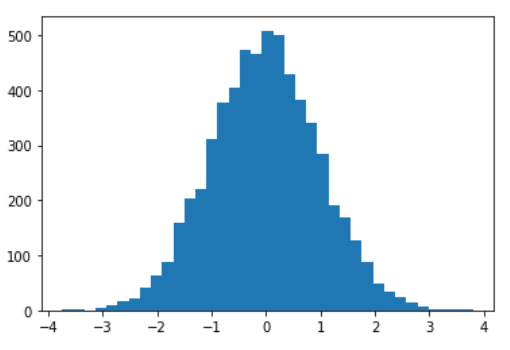
x = np.random.normal(size=6000)If we plot the histogram using plt.hist function, the default number of bins is 10.
plt.hist(x)
plt.show()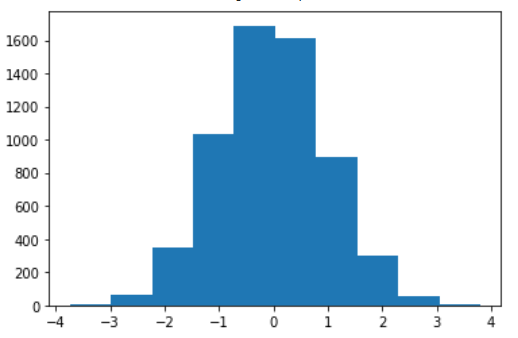
As we can see, it’s similar to the original normal distribution, but it’s still a bit coarse-grained. If we increase the number of bins to 100 we get:
plt.hist(x, bins=100)
plt.show()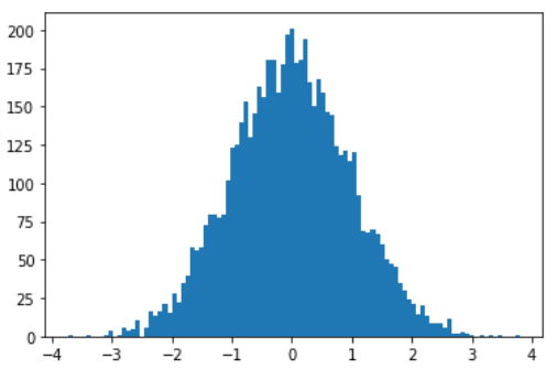
Now it’s too fine-grained and this produces some noise.
The problem is, then, how to choose a number of bins that gives us a good idea of the distribution without plotting a too noisy or too useless histogram.
Rice criterion
A good criterion to choose the best number of bins k is Rice criterion. It relies on this formula:
k = [2\sqrt[3]{n}]As we can see, it depends on the number n of the points of our dataset. The higher the number of the points, the higher the number of the bins in order to better represent the distribution. The use of the root ensures that this number doesn’t increase too much.
If we use this criterion, the result in Python is:
plt.hist(x,bins="rice")
plt.show()
As we can see, this new histogram is less noisy than the previous one and gives us a better understanding of the shape of the distribution.
Conclusions
Mastering the art of drawing a histogram is very important for a data analyst. Rice criterion is a very good criterion to draw a chart that gives us some useful information with less noise. It’s not the only criterion that can be used, but according to my experience is the most useful one. An essential tool in a data scientist’s toolkit.