

Measuring the predictive power of some feature in a supervised machine learning problem is always a hard task to accomplish. Before using any correlation metrics, it’s important to visualize whether a feature is informative or not. In this article, we’re going to apply data visualization to a classification problem.
How does a numerical feature affect a categorical target?
There are several ways a numerical feature can be predictive against a categorical target. For example, in blood analysis, if some value exceeds a threshold, the biologist can assume that there’s some disease or health condition. This is a simple example, but it gives us a clear idea of the problem. In the numerical feature domain, we must find some sub-intervals in which the categorical target shows one value that is more frequent than the others. This is the definition of the predictive power of a numerical feature against a categorical target.
This may happen for as many sub-intervals as we want (and it’s, practically, how decision trees actually model our dataset).
Data visualization
Before digging into the numerical estimation of such a correlation, it’s always useful to visualize it in some unbiased way.
In my free course about Exploratory Data Analysis in Python, I talk about a particular visualization that is the stacked histogram.
Practically speaking, we perform the histogram of a variable and each bar is split into stacked sub-bars according to the values of the target variable related to that bin of the histogram. Here’s an example:
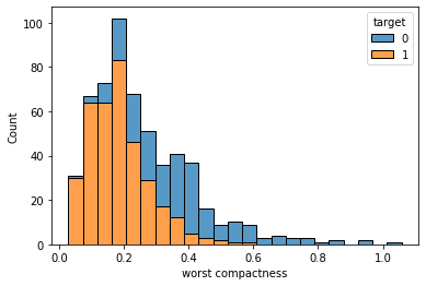
As we can see, before 0.3 the majority class is 1 (the bars are almost yellow), while for higher values the bars become bluer. This is a strong correlation between the numerical feature and the categorical variable because we’ve been able to spot two intervals in which one value of the target variable is significantly more frequent than the others.
The idea with this histogram is, then, to look for ranges in which one color appears more frequently than the others. With this approach, we can say that there’s a threshold that determines the behavior of our target variable according to the feature value. That’s exactly what models need for being able to learn.
Such correlations can be easily spotted by logistic regressions and binary decision trees, so this analysis can give us a good piece of information about the type of model that may actually work.
Let’s now see an example in Python.
An example in Python
For this example, I’ll use the breast cancer dataset included in scikit-learn library.
First, let’s import some libraries.
import seaborn as sns
import matplotlib.pyplot as plt
from sklearn.datasets import load_breast_cancer
Then, let’s import our dataset.
dat = load_breast_cancer(as_frame=True)
df = dat['data']
df['target'] = dat['target']
Let’s assume that we want to visualize the predictive power of the “mean radius” feature. We can draw the stacked histogram with just one line of code:
sns.histplot(df,x="mean radius", hue="target", multiple="stack")
Here’s the result.
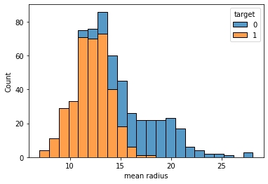
As we can see, there’s a threshold around 16 below which we have 1 as a majority value for the target variable and above which we have 0. So, we can say that this variable is predictive and informative.
We can now perform this exploratory analysis for each numerical variable in order to visualize their predictive power.
Conclusions
In this article, I’ve shown my favorite way to visualize the predictive power of a numerical feature against a categorical target. This may not be the only possible approach. For example, a 100% stacked histogram may be more readable. The general idea is that we always need to visualize information before calculating any number and using such types of charts can improve the quality of our project, producing a good deliverable at the same time.

Very helpful – how would you write the code to loop through ALL/EACH of the feature columns and plot (and save the plot) for each… I have a dataframe of 1 target/label column and 258 features… I can’t change the x input of the histogram plot 258 times…
Ideally, I would be able to loop through the plotting, saving each plot as a png file and using the x label for each one as the filename of the plot saved.
Hello, Michael. That’s a very good question. Here’s an example of the code, taken from my Exploratory Data Analysis course.
fig , axs = plt.subplots(len(columns),1,figsize=(5,5*len(columns)))for i in range(len(columns)):
column_name = columns[i]
sns.histplot(df,x=column_name, hue="target", multiple="stack",ax=axs[i])